How do I brand my HighLevel client portal so it looks like me?
Updated 4 August 2026 by Chantal Edouard-Betsy.
You want to brand your HighLevel client portal so it looks like your business and not the factory default every other portal ships with. Good news: most of it is done in the built-in settings, no code, in about ten minutes. I branded my own heyCEOflow portal end to end recently and it turned a few heads, so let me walk you through exactly what to set, the traps that caught me, and the one line where the settings stop and custom work begins.
Quick answer: To brand your HighLevel client portal, go to Memberships, then Client Portal, then Settings, then Branding. Set Brand Color One (it drives most of the portal), Brand Color Two, a square logo, a tall portrait login image, your favicon, portal name and support email. Then use App Permissions to switch off any sections you do not use. That gets you a portal that looks like your brand with no code at all. The catch: the settings colour the obvious elements but do not reach the fonts, the leftover greys or the shapes, so a fully designed portal needs custom CSS at the portal level. I am Chantal Edouard-Betsy, founder of heyCEOflow, and a properly branded portal is the thing clients notice their own clients commenting on.
Before the how-to, one myth to clear. Most people assume a portal that looks stock is just how HighLevel is, and there is nothing to be done short of hiring a developer. Not true. The built-in settings get you a long way on their own, and you would be surprised how few people ever open them.

In this blog
- The five settings that do the most
- Where the built-in settings stop
- The last mile: custom branding
- Do it yourself, or have it done
- FAQ
- Key takeaways
The five settings that do the most
You will find these under Memberships, then Client Portal, then Settings, then Branding. First though, you need the new portal turned on. If you have not done that yet, here is how to enable the new client portal. Then work through these.
Brand Color One. The big lever. It drives most of the portal's colour, so give it your real primary brand colour, not something in the same postcode. Set Brand Color Two to your secondary.
Your logo, uploaded square. One to one, around 200 by 200. This caught me out. The portal stretches a non-square logo to fill the slot rather than cropping it, so a wide logo comes out squashed. Feed it a square file and it behaves.
The login-screen portal image. This wants a tall portrait, not a logo. It fills roughly half the login page and it hides on mobile, so use a lovely vertical photo of you or your work, near an 8 by 9 shape. This one field does more for the "oh, this feels expensive" reaction than almost anything else.
Favicon, portal name, support email. Small, but set them all. The tiny details are the ones that say a real person runs this.
App Permissions. Switch off whatever you do not use. No invoices in the portal? Turn the tab off. An empty section reads as unfinished, while a tight portal showing only what you offer reads as deliberate.
Do those five and you are already ahead of most portals out there. And if your course pages have gone plain since the last update, that is a related but separate issue. Here is why your course pages lost their styling and how to get it back.
Where the built-in settings stop
Here is the honest line. The settings colour the big, obvious elements and drop your logo in. They do not reach the fonts. They do not touch the greys HighLevel leaves sitting in the corners. They do not change the shapes, the buttons, the spacing, the little details that make something feel designed rather than decorated. Stock is stock, and past a certain point the panel runs out of levers.
That is not a criticism of HighLevel. It is just where a settings panel naturally ends. Anything past it lives in custom CSS at the portal level, which is a different kind of job.

The last mile: custom branding
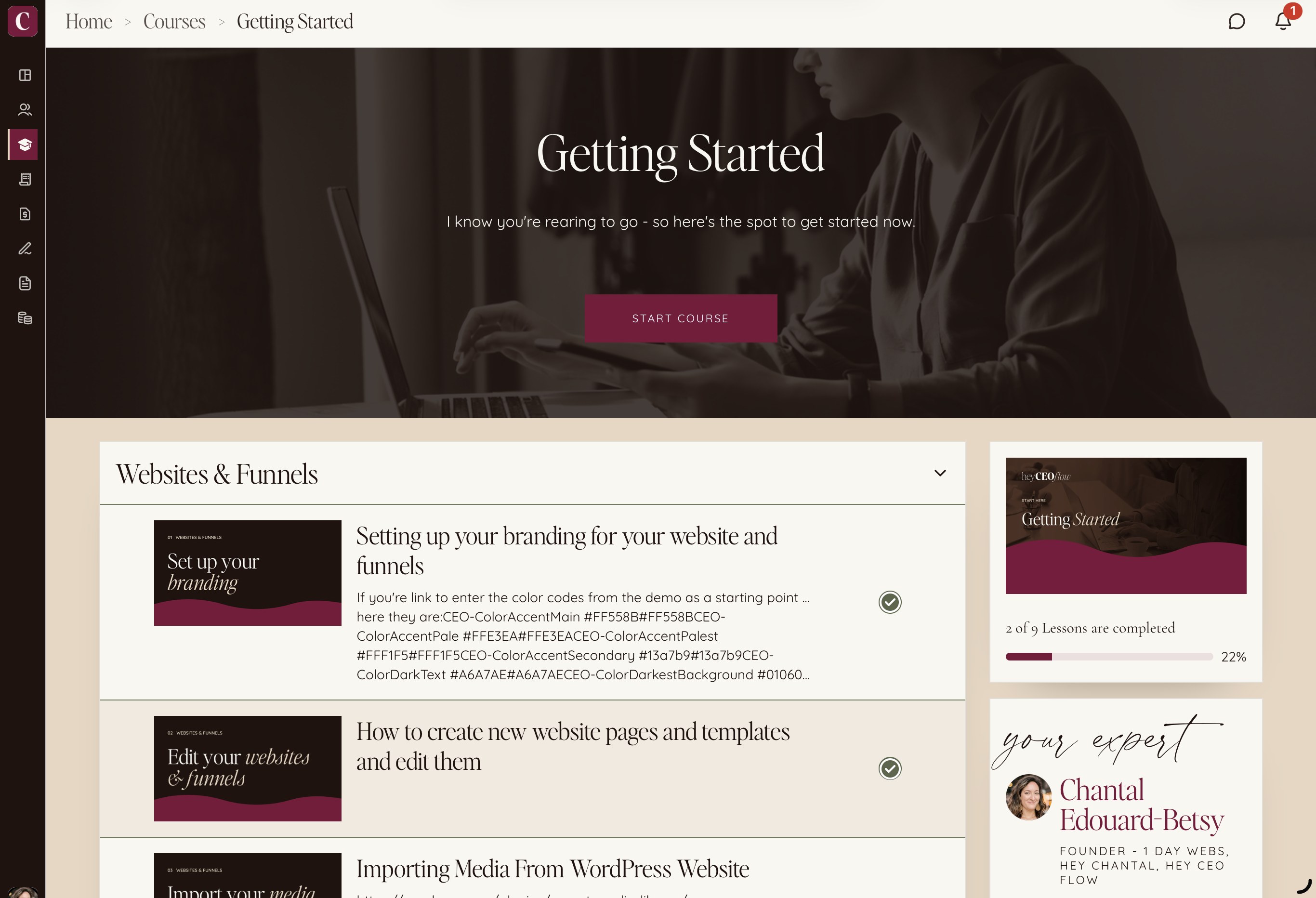
The portal I posted, the one that got the reaction, was not built in the settings panel. The settings got it maybe two-thirds of the way. The last third, the colour reaching into every corner, the fonts that are actually mine, the greys turned brand, the shapes made intentional, that is custom work at the portal level. It is the part that makes someone stop and go "wait, that is HighLevel?"
This is also part of running your whole business on one platform: when your client portal, courses, payments and site all live in one place, branding that one place properly means your clients meet one coherent brand instead of a patchwork. That coherence is what reads as expensive.
One caution I have written about separately: custom portal CSS needs maintaining, because HighLevel keeps changing the portal and copied stylesheets break at the next update. So the last mile is not just doing it once. It is keeping it right.
Do it yourself, or have it done
The five settings above? Do those yourself today. Genuinely. You do not need me for that, and you will feel the difference immediately.
The custom last mile is the part worth handing over, especially if you are the founder rather than the designer. I brand HighLevel portals end to end, the dashboard, the login, the courses, the lessons, so what your clients log into looks like the brand you have spent years building, and I keep it maintained as the platform changes. If that is what you are after, the fastest way in is a quick call.
FAQ
Can I brand my HighLevel client portal without code?
Yes, to a point. In Client Portal settings you can set two brand colours, a logo, a favicon, a login-screen portal image, the portal name and support email, and switch off sections you do not use. That covers the obvious elements with no code. Fonts, the leftover grey areas and the shapes need custom CSS at the portal level.
What size should my HighLevel portal logo and login image be?
Upload the logo square, one to one, around 200 by 200, because the portal stretches a non-square logo rather than cropping it. The login-screen portal image wants a tall portrait, near an 8 by 9 shape, since it fills about half the login page and hides on mobile. Use a vertical photo, not a logo, for that slot.
Why does my portal still look generic after I set the colours?
Because the settings only reach the obvious elements. The fonts, the background greys, the button shapes and spacing are not exposed in the branding panel, so a portal can have your colours and still feel stock. Taking it further needs custom CSS at the portal level.
What is Brand Color One in the HighLevel portal?
Brand Color One is the primary colour that drives most of the portal's look, so it should be your actual primary brand colour rather than an approximation. Brand Color Two sets the secondary. Getting Brand Color One right does most of the visible work.
Will my portal branding break when HighLevel updates?
The built-in settings are safe, but custom CSS can break when HighLevel changes the portal, which it does regularly. Copied or one-off stylesheets tend to fall over at the next update, which is why custom portal branding needs ongoing maintenance rather than a single setup.
Should I pay someone to brand my client portal?
Do the built-in settings yourself, since they are quick and free. Consider paying for the custom last mile if you want a fully designed portal and you are not the technical person, or if you want it kept maintained as the platform changes so it does not revert to looking stock.
Key takeaways
- Most portal branding is done in the built-in settings with no code: Brand Color One, a square logo, a portrait login image, favicon, portal name, and App Permissions.
- Upload the logo square and use a tall portrait for the login image, or they come out wrong.
- The settings stop at the obvious elements. Fonts, greys and shapes need custom CSS at the portal level.
- The custom last mile is what makes a portal look genuinely designed, and it is the part worth handing over.
- Custom portal styling needs maintaining, because HighLevel keeps changing the portal.
Want your portal taken all the way?
Do the five settings yourself today. If you want the custom last mile, the version people stop and stare at, and you would rather it stayed right as HighLevel changes things, that is what I do. Book a quick call and I will show you what your portal could look like.


